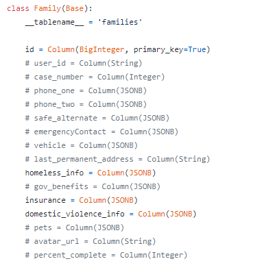
Family Promise Goes Digital
I recently worked with an organization called Family Promise. They help homeless families by offering them shelter until they can get back on their feet. There are a few ways a family can “exit” the shelter (i.e. permanent exit, transitional exit, temporary exit, etc). The problem we have tried to help solve is the problem of effectively predicting how a family will exit the program. The product we’re making is an Executive Manager dashboard that brings up all the info on a potential guest family and uses that information (along with information on all the past families to come through the shelter) to predict the way the potential family would exit the system if permitted to stay. This process is currently done entirely on paper. We are trying to help them usher in digital methods to replace the paper ones and enhance the overall experience of all parties involved.
Behind the Scenes
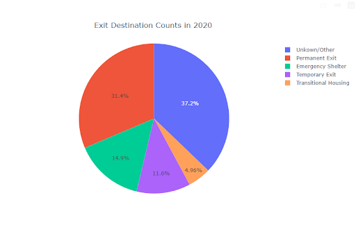
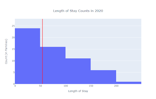
Personally, I was able to use the data to make several graphs for the executive dashboard. I was also able to use my Windows Subsystem for Linux (WSL) to make the correct Pipfiles to make our entire project compatible with Amazon Web Services (AWS). I also added a feature that allowed us to filter the data by year and helped to convert our database into a pandas dataframe for Exploratory Data Analysis (EDA), feature engineering, and graphing.
Here’s a couple of example graphs I made using data from the database:
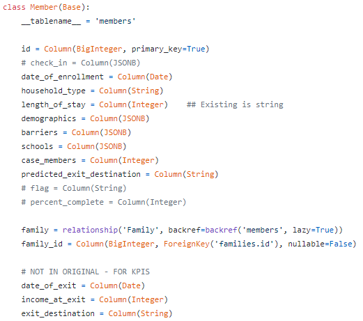
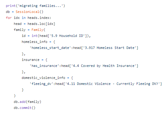
We ran into a big technical challenge when we were told that there were two databases that we needed to connect: the live one with little information, and the historical database. We looked at the two and quickly found out that they had different column names in their respective tables. So we spent days trying to find all the matching columns that were relevant so we could make the right api calls to be able to transfer the historical data to the live database. It was more work than it was worth to spend all that time connecting the databases, so we eventually solved this problem by creating a new database altogether based on the historical database and had that one replace the live database.
Here’s some code snippets from the code used to create the new database:
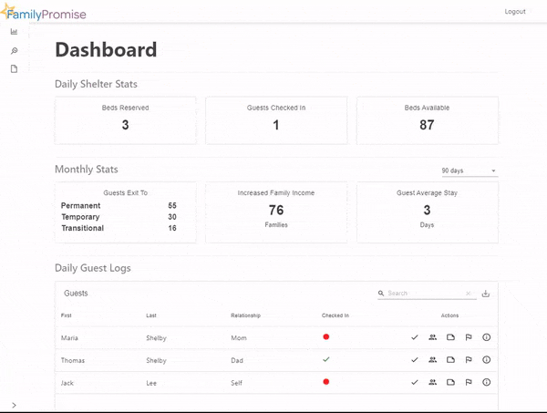
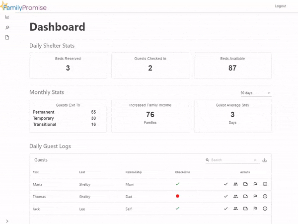
Helping a Homeless Shelter Give Better Help
We were able to attain a Minimum Viable Product(MVP) for the Executive Director Dashboard. We made a working page and we were also able to make a working predictive model that predicts the exit type of potential guest families. We were able to successfully implement DocuSign as well.
In the future, the Executive Director dashboard will continue to improve, but many more staff roles will be added as well. The Executive Director Dashboard will contain more information, more data visuals, and an all around better aesthetic. The other staff roles will have similar dashboards relevant to their positions and responsibilities as well. We’ve all worked really hard this month and we’ve come a long way together. At the start of this I was having a hard time getting engaged because I didn’t feel like I knew what was going on. I was waiting to understand something before asking any questions. I eventually reached out and received the feedback that I needed to have better communication with the team! I finally started talking with the rest of my team and found that I wasn’t the only one who was confused! We were all able to come together because of that and I was able to become much more involved in the project after that! I think this project has helped further my career, not in a technical way, but rather, in a more social way. I have learned more about team communication and the courage I need to succeed as part of an effective team.